Sunday, July 21, 2013

Haul, Swatches, and Review: Wet n Wild Pop Art Craze Limited Edition Trios in I'm Seeing Triples!, Three's a Party, and A Regular at the Factory

I was supposed to be on a no buy until the start of August, but some lovely Limited Edition items broke my resilience.

I'm an absolute sucker for Wet n Wild...I think it is just about the best value out there on the market. It's dirt cheap, but still usually amazing quality. By purchasing these shadows, you can experiment and play with new colors without breaking the bank.

The brand recently brought out a collection of Pop Art Craze trios inspired by Andy Warhol and the girls of the Factory. I think that's a really interesting era of art and was very excited to pick up a few pieces.

My local Walgreen's had a small display of all of the trios, so I had to make the tough decision of which ones I should buy. I could have picked up all of them, but I decided to have at least some self restraint and limit myself to three. Here's what I picked up.


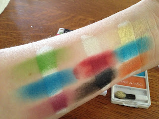
I'm Seeing Triples! has a soft green, a bright blue, and a plummy purple. Three's A Party has what is somewhere between a white and a cream, a red (a rarity for the drugstore!) and a matte black. A Regular at the Factory has a soft butter yellow, a bluish teal, and a warm almost rusty orange.


I hate the applicators that come with it, but I ended up keeping the sponge tip ones because it is a decent way to pack on the color.


And here's the swatches. Each trio is swatched over NYX Jumbo Eye Pencil in Milk. As you can tell, the pigmentation only comes when a white base is used. I have to say, I'm not too impressed with these shadows. Wet n Wild usually has stellar pigmentation without a base, but that is clearly not the case here. What is does have going for it is that the colors are very unique for the drugstore. I've been playing with different combos, and my favorite is a sunset eye--the yellow on the inner portion of the eye, blended into the orange, and then blended into the red on the outer portion of the eye. Another downside is that it would be hard to make an actual look out of just one trio. I suppose a look could be made with just Three's a Party, but I feel like a balanced look would require supplemental shadows for most of the trios. However, that's not something I'm very concerned with because I would rather have a unique color than yet another browbone highlight shade.

So, in summary, it isn't the greatest quality, but I would still urge you to pick these up. The price is right, just under three bucks a pop, and I love collecting Limited Edition items. If you see them while you're out at Walgreens, be sure to snag them before they're gone!

Until next time, kiddos,
xo, Maria.


Tuesday, July 9, 2013

B&A and FOTD: My "Everyday" Face

I try to mix up the products I use on my face everyday. In fact, there is not even a single foundation I use everyday. I love trying out new things and trying to incorporate fun pops of color into my look. There are a few consistent attributes of my look that remain essentially the same: perfected, dewy skin that is light enough to still show my freckles, something to make my small eyes appear larger, natural but slightly more perfected brows, and lipstick...allllllways there is lipstick.

I've been working at an office this summer, so I've been utilizing some of the softer, more professional products in my collection. I don't have a standard routine, but this is a before and after of the sort of look I've been sporting quite frequently.


Oooooooh my gosh. That is so insanely unattractive. Granny curlers...undereye bags...lots o' blemishes...barely open eyes. It must be morning! But this is what I look like literally when I wake up first thing in the morning.


And here's an after shot. Ah, much better! I have kind of hooded eyes so you can literally see nothing of my eye makeup...


I've been using my new custom MAC quad, and I'm loving it! 


This summer, I've been wearing my glasses on a day-to-day basis because I get up waaaay too early for my eyes to be accepting of contacts, so this is my glasses look.


These are the products I used!

  • L'Oreal True Match Lumi foundation--this stuff is a revelation for girls with dry skin! I love a glowly look, and this helps you achieve it. In fact, I'm so happy with this foundation that I haven't got around to actually purchasing a high end foundation. I'm so happy with this one!
  • Some random lip balm
  • Real Techniques Expert Face Brush--the only brush you'll ever need for foundation application!
  • Benefit Stay Don't Stray Primer--it's an "eh" product. It gets the job done, but once you've used NARS primer, it's hard to go back.
  • Bobbi Brown Corrector--Love this! It's the first thing I've used that actually makes my undereye circles look decent.
  • Hard Candy Glamoflauge--it's nice enough. I have it in Ulta Light, which is perhaps a touch too light for me.
  • Revlon Nearly Naked Powder--This is nice, but I'm almost out and want to try something new.
  • NARS Blusher in Douceur--LOVE THIS STUFF LIKE WOAH. The perfect natural flush for a pale girl.
  • ELF Eyebrow Kit--eh, it gets the job done.
  • MAC Quad with Blanc Type, Wedge, Satin Taupe, and Sketch--I used ST on the lid, Wedge in the crease, and BC under the brow. 
  • Essence Brow Gel--gets the job done. It's hard to justify spending over $3 on brow gel once you've tried this stuff!
  • MAC 217--like I could do all of my makeup with this one type of brush if I had to. You have to have this.
  • Sonia Kashuk Shader Brush--It's hard to distinguish between shader brushes. I honestly believe it's the brush that you don't need to spring for. 
  • Tarte Lash Curler--I hate this thing. I'm just waiting to replace it when I can.
  • MAC Syrup--the ultimate "my lips but better" shade. You can tell that I literally already have only a nub left. Don't worry, I've already got a backup!
  • Real Techniques Blush Brush--like the rest of the brushes of this line, it's very nice.
  • Urban Decay 24/7 Liner in Hustle--love this brownish copper shade, I feel like it goes very nicely with my eye color.
  • Rimmel Eyeliner in Nude--This stuff is supposed to last in your lash line, but it doesn't on mine. I guess my eyes are too watery.
  • Maybelline The Rocket Volume Express Waterproof Mascara--THIS STUFF IS DA BOMB DOT COM. I bought it on leighannsays's recommendation, and it's perfect for stubbornly straight lashes. 
So yes, this is a typical look for me at the office. Definitely an improvement over the before!

Until next time, kiddos,
xo, Maria.


Monday, July 8, 2013

Review, Swatches, and FOTD: Meet Matt(e) Nude Palette from theBalm

As any Internet-obsessed makeup addict knows, Hautelook can be a pretty great site for scoring beauty deals. A brand that is frequently featured is theBalm. In fact, they are on the flash sale site so often that I can't justify buying the brand at full price. The complaint I have is that the site takes so long to ship, and the shipping is about $6, which may not sound like a lot, but when the whole point of the site is that it's a flash sale that will save you money, it adds up. I ordered this palette at the beginning of May, and it took until the end of the month for it to get to me.

I wanted this palette because I've been allllll about matte shadows recently. I think it's because I've started working in an office, and glittery shadow just feel a bit inappropriate. This summer, I've switched to matte shadows, started going to bed before midnight, and had to spend a ton of money on replacing a flat tire. I'M A FULL FLEDGED ADULTS, GUYS!

Like I said, it took forever for this palette to ship to me, but my oh my, was it worth the wait!


Here he is, the beauty. The cover features a good-lookin' man whose teeth literally sparkle.


These eyeshadow pans are HUGE. I literally don't know if I will ever hit pan on anything.


Swatchy, swatchy. These are so lovely. These are just a single pass of the shadows on my arm without any primer or base. Matt Johnson is a sort of gray-navy, Matt Garcia is a deep warm brown, Matt Malloy is a lovely pure white, Matt Rosen is a warm orangey-brown, Matt Wood is a super dark brown that looks almost black when swatched, Matt Singh is a peachy-beige that I'm OBSESSED with, Matt Abdul is a grayed taupe, Matt Lombardi is a dark yellow that is ideal for blending out crease shades, and Matt Hung is a burgundy brown. Aren't I super good with color descriptions?

This palette is so awesome. The formula of the shadows is the best I've ever seen for mattes. They are creamy, pigmented, and not at all chalky. A variety of looks can also be achieved with this single palette. While overall the palette is cool toned, there are enough warm shades to create that kind of look if it strikes your fancy. If I'm running late for work, a super simple eye look is Matt Singh all over the lid, Matt Abdul in the crease, and a bit of Matt Malloy under the eyebrow. I personally don't use Matt Malloy as an inner corner highlight because I'm not a fan of the super white tearduct look.


Here I am with a quick look I created as soon as this came in the mail. Please ignore the blemish on my forehead that is covered with a concealer that is so obviously not my shade. I was matched to NW20 at the MAC counter months ago, and this concealer is so hilariously wrong for me. But I use it sometimes because it's too late to take it back and I hate wasting it. 


Here's a close up of the eyes. Not the most impressive or creative, but it was nice and simple, yet pulled together.

Overall, I'm so in love with this palette. I think it is worth the full price, but I would just hold out until it's on Hautelook next if you don't mind waiting a few weeks for shipping.

Until next time, kiddos,
xo, Maria.


Sunday, July 7, 2013

FOTD: My Attempt Do Free Wheelin' 1920s Flapper Makeup

The 1920s have been all the rage recently. I myself am a Fitzgerald fan girl, but I've been kind of avoiding the whole 20s trend for a variety of reasons.

1) The clothing style of the 1920s does not suit me. At all. The whole point of the era's fashion was to break out of the Victorian mold and embrace a more boyish silhouette. While this may have looked dashing on the daring ladies of the Jazz Age, my curvy figure needs the hourglass silhouettes of the 1940s. A dropped waist makes me look like a rectangle, which is not super appealing.

2) This is going to sound like a pretentious hipster, but I try to avoid trends when it comes to makeup. It's certainly impossible to avoid sticking to trends entirely, but I prefer to play around with what I'm personally loving and personally suits me, instead of what all the other kids are doing. YA HEAR THAT? I DON'T BEND TO PEER PRESSURE! #DAREgraduate

3) The 1920s was all about the dark eyes. I have small eyes that I am extremely self conscious about. For the entirety of high school, I packed on black liner to my lower waterline. This was not a good look. I remember staring in the mirror when I got ready wondering why my face looked so unbalanced. If only the Doctor would come along...we could pop into the TARDIS and I would sprint into the bathroom, pry the kohl from my pale hands, and replace it with a nice nude. Maybe high school wouldn't have sucked then...Enough whining about high school, onto the post!

I'm an avid reader of the reddit forum, MakeupAddiction, aka reddit.com/r/MakeupAddiction. Those girls and guys are the bomb diggity. That subreddit is seriously my happy place. A few days ago, there was a FOTD challenge to do a 1920s inspired face. I was just lounging around the apartment, so I figured, why not?!

Here was the end result:


This is ridiculously out of my comfort zone, but it was fun! I really tried to channel what I believe to be the point of the beauty revolution of the 1920s. It was all about sticking it to the man; throwing off the chains that was Victorian innocence and chastity, and embracing a lifestyle of the Lost Generation. Their eyes were dark and smudgy and imprecise, and they often used dark lipstick in the shape of a Cupid's bow. Additionally, the cosmetics of the day basically only allowed for matte, pale faces. I'm sitting at about NW15 with dry skin, so I naturally fall into a matte, pale face. You guys, I would have been sooooo popular back then. But I digress.

I tried to use the Urban Decay liner in Perversion as a base, but it wouldn't smudge at all! That's a good thing when you're using it as an actual liner, and a bad thing when it's meant to be a base. I then packed the black, glittery shadow from the Lorac Femme Fatale palette that was a Hautelook exclusive almost a year ago. I winged it out and tried to make it as smoky and imprecise as possible. I then lined my waterline with Perversion, which I hadn't done in about four years. I'm actually a fan of how this looks! I'm definitely going to be busting this eye look out at the bars sometime. I also used Perversion to fill in my brows, which made them look a bit odd, but oh well. 

The lipstick is NYX Violet Ray, which looks so different on my lips than in any other swatch online. I bought this on a whim about a year ago and have only worn it once, I think. Note to self: wear this more! I love this shade.

Overall, I really liked challenging myself to create this look.


OH SO SULTRY. Just kidding. I couldn't be sultry if my life depended on it.

Until next time, kiddos,
xo, Maria.


Saturday, July 6, 2013

Review and Swatch: MAC Mineralize Rich Lipstick in Lady at Play

If I was only allowed to use one type of cosmetic for the rest of my life, it would have to be lipstick. I freaking love lipstick. It completely transforms your entire face in one step. I love all kinds of colors: bold reds, bright pinks, crazy purples, sometimes even a nude. Additionally, if I was allowed only one lipstick brand, it would have to be MAC. No one comes close to their variety of colors and finishes. So naturally, I get excited every time MAC announces a new kind of lipstick finish. The Mineralize Rich formula came out a few months ago, but you know. Here at EngineeredBeauty we like to be fashionably late to the party. They are $22 for 3.6 g, as opposed to the $15 for a regular MAC lipstick for 3.0 g. With the Mineralize Rich lipstick, you're paying $6.11 per gram, and with the normal lipstick, you're paying $5.00 per gram. This means that the regular lipstick is a better monetary value, and I imagine that the increased cost comes from the new, fancy packaging.

According to MAC's website, the Mineralize Rich Lipstick is, "a 77-Mineral Moist Complex that instantly nourishes lips with maximum moisture in a lightweight, non-sticky formula. Larger bullet applies bright, long lasting colour in a single stroke. Medium shine finish, buildable coverage. Magnetic closure." Not sure if there are 77 minerals in the lipstick, or if that's just some marketing spiel.

I can confirm, though, that Lady at Play is moisturizing, lightweight, non-sticky, a larger bullet, a long lasting color, medium shine, buildable, and housed in a magnetic closure. Way to be accurate, MAC website!


The packaging is larger than the normal MAC lipstick with a really cool magnetic closure. I'm a big fan of the magnetic closure; there's less of a chance of the lid popping off in my bag, and it's fun to play with. These are the things I care about.


Lady at Play is described by MAC as a "mid-tonal cool tangerine." I'm not entirely sure how much I agree with that description. To me, it's more of a neutral pinky coral. 


Swatchy swatchy. This thing is super pigmented, y'all. This was two swipes of color. When worn on the lips, it feels like there's basically nothing at all. I really like the level of shine to it. I'm a matte lips girl, and this seems like a happy medium between the matte-ness I love and a glossy creme. I would compare the feeling on the lips to a Revlon Lip Butter, but this is much more pigmented. A good thing about this lipstick is that your lips don't have to be in the best shape for this to work. 

Lady at Play is a bolder color, but I feel completely comfortable wearing it in the office because it's a no-fuss color. 


This was me putting it on in the car as soon as I purchased it. It was love at first sight. 


Here's me wearing it at work. Loving how you can't see my eyes because of the lenses of my glasses. 


And here's me making a confused face and wearing it with some bad hair. Also, please don't judge me for the Hollister polo. I love polo shirts and it was half off. I had to suffer ten minutes of breathing the cologne-infested air of that wretched place to get this shirt, okay! Cut me some slack!

Overall, I freaking LOVE Lady at Play. The formula is amazing, it sits so nicely on the lips, and the color is fantastic. It's an everyday way to way a bolder summer shade...although let's be real, I'm still going to be rocking this baby in the dead of winter. I love it that much.

So get thee to a MAC counter! And grab you some of this goodness!

Until next time, kiddos,
xo, Maria. 

Friday, July 5, 2013

My Semi-Failed Adventures in Depotting: A Crappy Tutorial

Wet 'n Wild eyeshadows are the little gems of the drugstore beauty scene. At a few bucks a pop, they have some seriously amazing pigmentation, and the texture is smooth as buttaaaaaah. I honestly prefer the formula to Urban Decay (in fact, I find Urban Decay to be vastly overrated, but that's another whole post altogether.)

When the eyeshadow trios and palettes are such a good value, you may accidentally acquire a large amount. This is where the problem starts for me. I live in a dorm room for the vast majority of the year (such tiny spaces!), then I'm back and forth between school, home, and my temporary apartment for my summer internship. When this is the circumstance, portability, convenience, and decreasing clutter is the name of the game. I was starting to be bothered by all the individual palettes. The answer, it seemed was depotting.

I've heard all the horror stories: smoke detectors blaring because of melted plastic, poor little powders smashed to smithereens by errant tweezers, huge messes coming from small packages. But, I had a free Monday night and the personally rare urge for a DIY project.

After some research, I acquired the following items from Walmart:


Two Crayola watercolor palettes, lighters, fancy shmancy duct tape sheets, magnetic sheets, and your desired shadows. 


I was going to be using Walking on Eggshells, Silent Treatment, Cool as a Cucumber, the infamous Comfort Zone, and my baby, the limited edition Drinking a Glass of Shine...as a sidenote, how the heck did they come up with that name! The special thing about that palette is that it is all matte, and they decide to throw the word "Shine" in the title?! How drunk were the Wet 'n Wild execs during that meeting?

First things first: I took out the watercolors and brush from the Crayola palettes. At the store, there was a generic brand that was a few bucks cheaper, but the case was yellow. And I detest yellow. So I splurged for white. I know, big spender over here! But yeah, the watercolors are still sitting on my coffee table. I don't know what to do with them, because I don't think I've used something like that since my age was in the single digits, but I feel bad tossing them. But after removing this, the first step is melting down the little nobs that held the brush in place. This did not go as planned.


Look, I'm using a lighter indoors! I'm so adult! But you can tell on the bottom left that this was harder than I thought. It was sort of impossible to cleanly scrape off those nobs. So now my palette has awkward bumps in it. Ah well, such is life.

Next, I peeled the stickers off the backs of the shadows, like so.


Then, I forgot to take pictures of the actual depotting of the shadows. Good job, Maria. But basically, I held the lighter under each well of shadow for about 20 seconds. I then used an old Urban Outfitters gift card to gently pry each pan up. I did it very slowly, but I actually only had one small casualty during this process...a sizable chunk of the gorgeous taupe in the Silent Treatment palette got knocked off. Moment of silence please...thank you.


Here's all the little beauties lying there, oh so naked!


AND HERE LIES THE SKELETONS OF MY ENEMIES, aka the melted remains.

So here's where it goes off the tracks. I had intended to make a magnetized palette, like those overly expensive Z palettes. Walmart had some magnetic adhesive sheets, which I thought would work super well.


Looks nice, right? Well, these magnetic sheets are crap. They are not capable of holding anything, let alone delicate eye shadow pans. So in a game time decision, I drove to the gas station and bought super glue. Super gluing the shadows down means I can't move them around or take them out, but I was happy with the order I put them in, and the case ended up being pretty sleek. I cut the pretty, shiny duct tape sheets to cover up the black of the magnetic sheets. You can't really even see them once the shadows were in, but it's nice in theory.


Aaaaand, here's the end result! I'm actually really please with it. It will be super easy to travel with, and I can now create a huge variety of looks with this one behemoth. I also depotted some blushers to put in the other palette, but I haven't worked my way up to putting it all together yet. Maybe someday I'll stop procrastinating and finish it...but considering how long it took me to put together a blog, this probably won't happen.


Super sexy bonus shot of my fingers with shadow literally glued to them. This didn't come off for at least 24 hours. It was super fun using CAD software the next day while I had green pigment all over my hands.

Well thanks for reading my VERY FIRST BLOG POST OMG. I'm really excited to start this blog, and I thought this would be a fun first post.

Until next time, kiddos, PEACE.